Title |
In Defense of Poor Media |
Author |
|
Date |
[Published in Printed Web 3, edited by Paul Soulellis, 2015.]
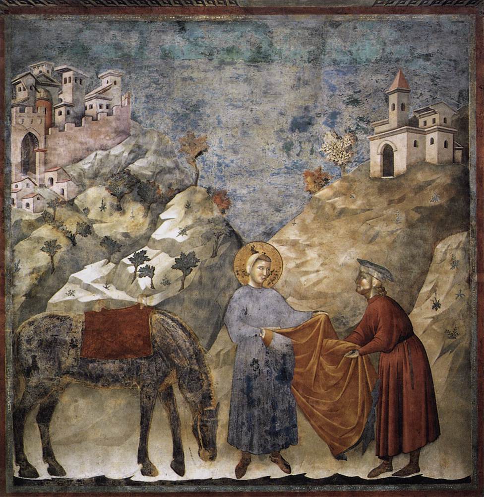
Fig. 1: St. Francis Giving his Mantle to a Poor Man, Giotto, 1297–1299. Source: http://www.wikiart.org/en/giotto/st-francis-giving-his-mantle-to-a-poor-man–1299
This text pays homage to “In Defense of the Poor Image”, an essay in which German artist and writer Hito Steyerl (2009) speaks of the kind of “charge” that the poor image – an image that “has been uploaded, downloaded, shared, reformatted, and reedited” – acquires while circulating through networks. I argue that, in the field of digital publishing, poor media are able to “transform quality into accessibility,” like the poor image does. Poor media substantiate the book’s potential for duplication and dissemination. Conversely, rich media are the product of a commercial doctrine based on an ornamental understanding of digital technology, a Hollywoodian rhetoric of engagement, and a reactionary conception of the publishing process.

Fig. 2: Portrait of Steyerl included in my bootleg version of “In Defense of the Poor Image,” designed by Luigi Amato.
Part 1: Rich Media
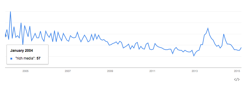
Fig. 3: Interest over time on Google Trends for the term “rich media”. Source: https://www.google.com/trends/explore?q=%22rich+media%22#q=%22rich%20media%22&cmpt=q&tz
In order to elaborate upon the concept of poor media, I’ll explore the notion of rich media in the first place. In the context of its ad system, Google provides the following definition: “A Rich Media ad contains images or video and involves some kind of user interaction. […] While text ads sell with words, and display ads sell with pictures, Rich Media ads offer more ways to involve an audience with an ad. The ad can expand, float, peel down, etc.” (“What Is Rich Media?” 2013). According to Wikipedia, “the term ‘rich media’ is synonymous for interactive multimedia” (“Multimedia” 2015).
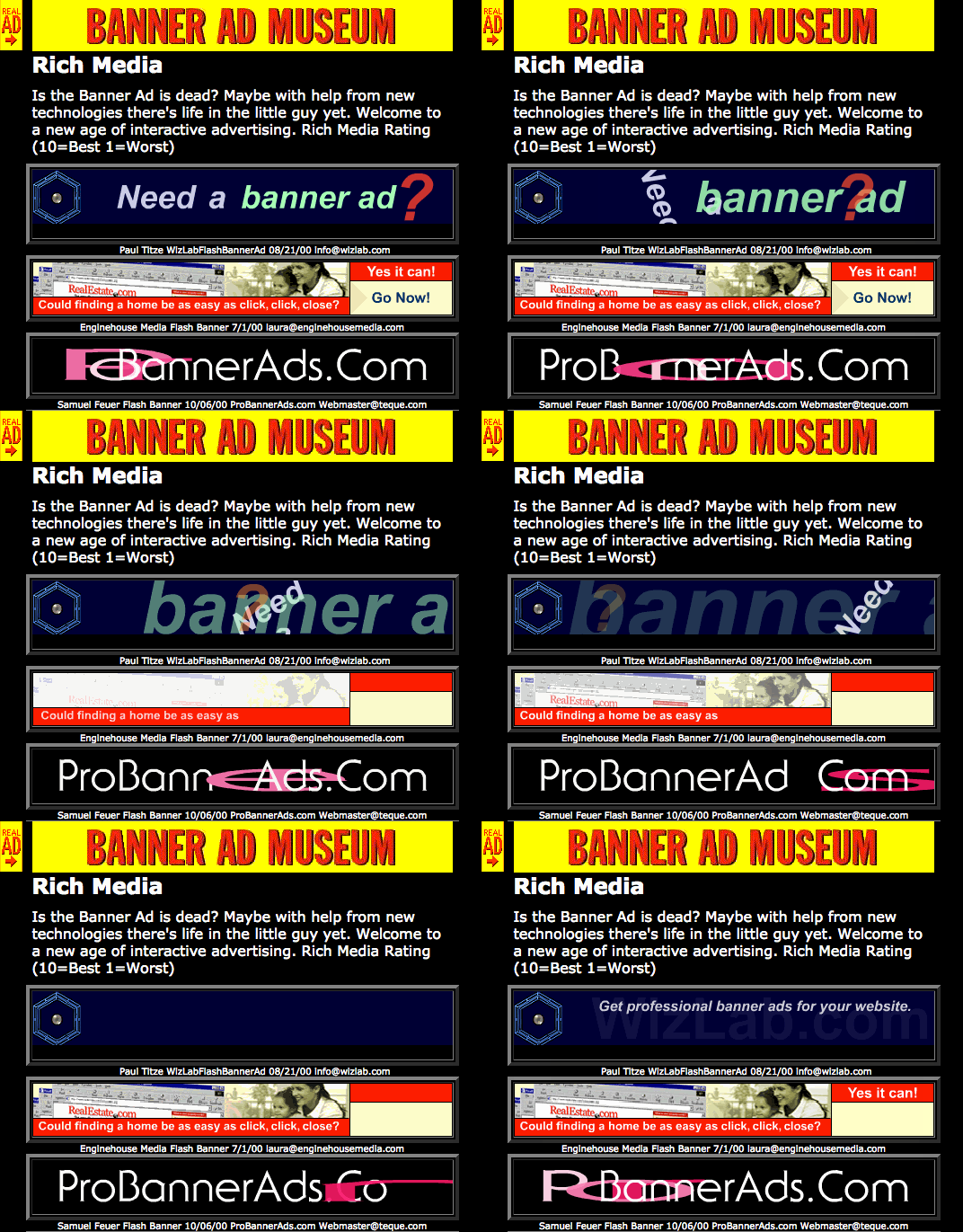
Fig. 4: Rich media banner ads archived by the Banner Ad Museum, 2001. Source: http://web.archive.org/web/20001017172752/http://www.banneradmuseum.com/Galleries/richmedia.html
Rich media emerged in a period when the bandwidth was growing and animated gifs were giving way to interactive Flash banners. It’s 2001 and “Rich Media is the buzzword of the moment, but many are still in the dark about what ‘Rich Media’ really is. […] Rich Media refers to the utilization of various technologies to enhance a recipient’s experience. Rich Media can be interactive, and can be tracked to determine among recipients the open, view and response rates to a campaign” (“An Overview of Rich Media” 2001).
While the expression ‘rich media’ seems to have originated in the field of advertisement and its usage over time looks fluctuating, I believe that it accurately reflects the combination of presumptions and expectations revolving around what was called electronic, and later digital, publishing. As I’ll discuss, its marketing connotation reverberates in publishing too.
As with the Daily Prophet browsed by Harry Potter, rich media are meant to bring to life an otherwise inert artifact by adding a ‘magical‘ element to the printed page. Computer pioneer Alan Kay (2001) speaks about magic as well: according to him, metaphors employed in user interfaces shouldn’t literally follow the physical world but express what it can’t be done there: “if [the screen] is to be like magical paper, then it is the magical part that is all important.”
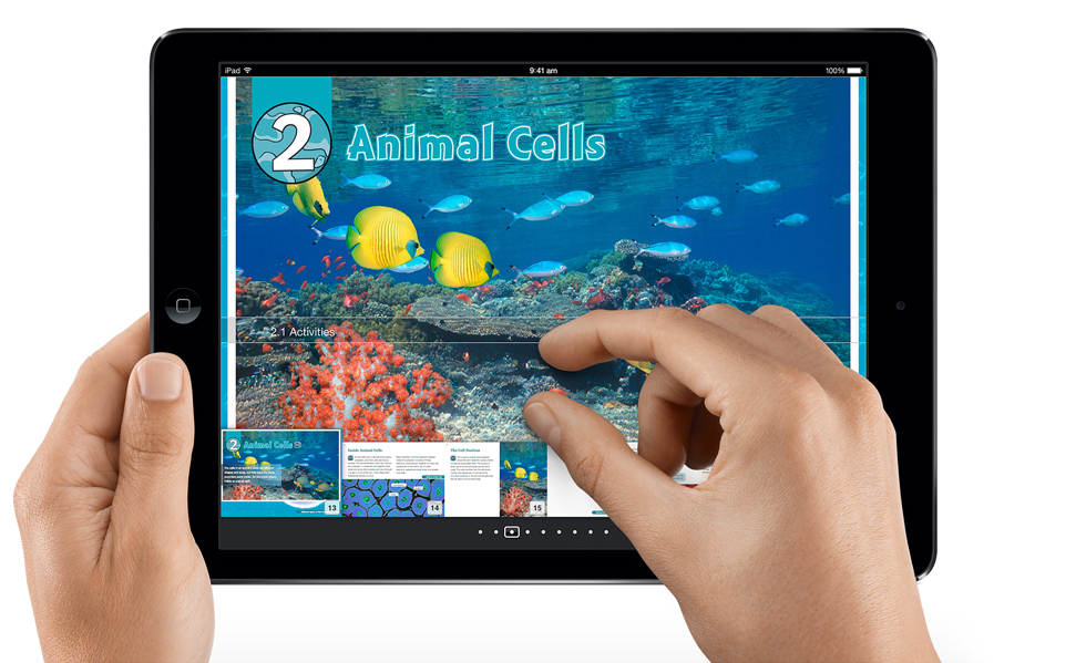
Fig. 5: An ebook made with iBooks Author. Source: https://www.apple.com/education/ipad/ibooks-textbooks/
In January 2012, Apple released iBooks Author, a software to create enhanced ebooks that can include “galleries, video, interactive diagrams, 3D objects, mathematical expressions and more”. These rich media “bring content to life in ways the printed page never could” (“iBooks Author” 2012). iBooks Author doesn’t require any coding or deep technical skill. In fact, users can choose among several ready-made templates and customize them according to their needs using a WYSIWYG interface. Finally, the books can be seamlessly made available into the Apple marketplace.

Fig. 6: A typical example of digital publishing commercial parlance, 2015. Source: http://publishingperspectives.com/2015/03/is-metabook-the-next-evolution-of-the-book/
The kind of slick enhanced books produced, distributed, and sold within the Apple ecosystem is what publishers, designers and readers often think of when asked about the ‘future of the book.’ Despite the fact that enhanced books represent a small, barely lucrative, slice of the overall production of ebooks (The Huffington Post 2012), practitioners of the field and the general public are still dazzled by books that change over time, books that speak back, books that self-destruct, books that react to the mood of the reader, books that connect to the physical location in which they are read, etc. Apparently, this is the avant-garde. The reality is that, the wheel is reinvented over and over.
In order to provide just a glimpse of the complex history of rich media and to extend the definition sketched above, I’ll briefly discuss some technologies, ideas, and particular moments that contributed to the development of such notion in the field of digital publishing.
E-Literature and Hypertext Fiction
The working definition of electronic literature (e-literature or e-lit) provided by the Electronic Literature Organization (ELO) encompasses “works with important literary aspects that take advantage of the capabilities and contexts provided by the stand-alone or networked computer” (“What Is E-Lit?”). Several genres can be seen as being part of it; one of these is hypertext fiction.
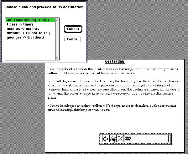
Fig. 7: A screenshot of afternoon, a story by Michael Joyce. Source: http://www.upf.edu/pdi/dcom/xavierberenguer/recursos/ima_dig/_7_/estampes/d2_14.html
Early interactive novels such as afternoon, a story by Michael Joyce (1990) and Victory Garden by Stuart Moulthrop (1992) are now considered milestones. These publications provided an impressive amount of narrative paths chosen by the user/reader. Both novels were realized using Storyspace, a software created by Jay David Bolter and Michael Joyce himself (another successful software to produce hypertext narratives was Apple’s HyperCard).
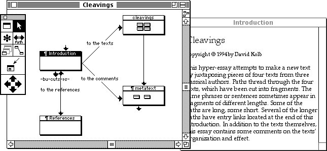
Fig. 8: A screenshot of Storyspace’s interface. Source: http://www.mprove.de/diplom/text/2.1.11_storyspace.html
Such pioneering works, together with the development of hypertext theory, let e-writers assume that the interactivity and non-linear possibilities offered by the hyperlink were to revolutionize literature (cfr. Hayles 2002, 27). In the New York Times Book Review, Robert Coover (1992) decreed the end of books as static, monolithic, and unidirectional experiences. On the contrary, “[w]ith its webs of linked lexias, its networks of alternate routes […] hypertext presents a radically divergent technology, interactive and polyvocal, favoring a plurality of discourses over definitive utterance and freeing the reader from domination by the author.”
Voyager Company’s Expanded Books
In an episode of the Computer Chronicles from 1993, Bob Stein presents some of the products of his Voyager Company, founded in 1985. Among them, The Beatles’ A Hard Day’s Night is an example of multimedia CD-ROM where the traditional categories of publishing begin to merge.
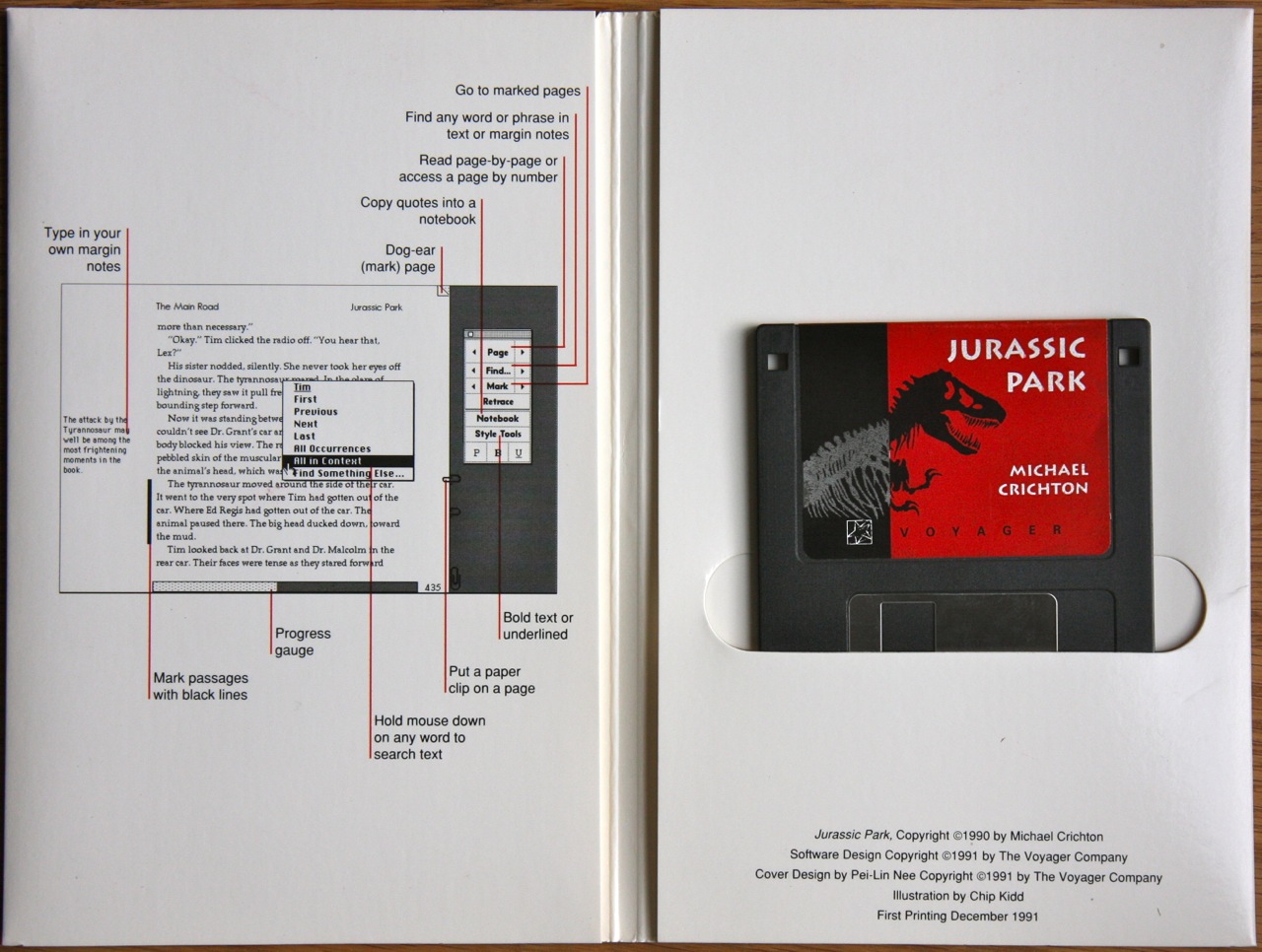
Fig. 9: Jurassic Park Expanded Book, Voyager Company, 1991. Source: http://alfabravo.com/2011/08/early-ebooks-and-why-they-failed/
Stein shows the Expanded Books as well: a series of ebooks on floppy disks for the Macintosh that “look like a book and to act like a book” (“Electronic Publishing” 1993). The Picture of Dorian Gray, one of them, includes functionalities such as text search, annotations, passages’ highlight. The anchorman acknowledges that it is more of a research tool than a book, but he doesn’t seem totally satisfied and asks for graphics. Stein reassures him by telling that the toolkit they sell allows creating ebooks including movies, audios, pictures, etc. As this excerpt shows, early ebooks suffered from an inferiority complex. Multimedia was the cure: video and audio made ebooks unique and more captivating than printed matter.
The iPad
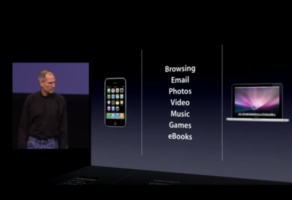
Fig. 10: Steve Jobs describes the key functionalities of the iPad, 2010. Source: https://www.youtube.com/watch?v=_KN–5zmvjAo
In 2010, the first iPad was released. During its first public presentation, Steve Jobs described the iPad’s core functions, the things that this new device was better at than the mobile and the laptop. These were: browsing the Web, reading emails, watching photos and videos, listening to music, playing games, and, finally, reading ebooks. Thanks to its handiness and its multi-touch, high-quality display, the iPad soon became the natural environment of rich media applications merging the key operations listed above.
Digital Publishing Suite

Fig: 11. Screenshot from webpage presenting Adobe DPS. Source: http://www.adobe.com/products/digital-publishing-suite-enterprise/features.html?promoid=KKSDH
In the current context of digital publishing, iBooks Author is not the only proprietary software available to produce rich media publications. Mostly employed to create enhanced magazines, the Adobe Digital Publishing Suite (DPS) was recently named “the leading digital publishing solution” (“Adobe Digital Publishing Suite” 2012). The DPS is meant to “create, publish, and optimize content-centric mobile apps”, another name for enhanced publications. DPS’ apps are supposed to be immersive and engaging, thanks to “sophisticated text treatments with video, audio, animation, and other highly interactive elements.” In order not to ‘shock‘ its users, Adobe designed the DPS as an appendix of InDesign; maintaining its print-oriented workflow basically intact.
Social Reading

Fig. 12: Tom Gauld for the New York Times, 2011. Source: http://www.nytimes.com/2011/03/06/magazine/06Riff-t.html
The notion of ‘social reading‘ emerged around mid–2011 (“Social Reading” 2015) when platforms like Goodreads – later acquired by Amazon – were quickly growing and e-reading devices like the Kindle began to let users share their reading activity on social media. According to the definition provided by OpenBookmarks, social reading is “everything that surrounds the experience of reading electronic books” (“What Is Social Reading?” 2011), like the following example:
You’re reading an ebook. You find a bit you like, and you select the text and email it to a friend.
Why do I consider social reading as a facet of rich media? Because some of the functionalities that go under the social reading umbrella – like the sharing of highlights – are often embedded into enhanced books.
All Together Now
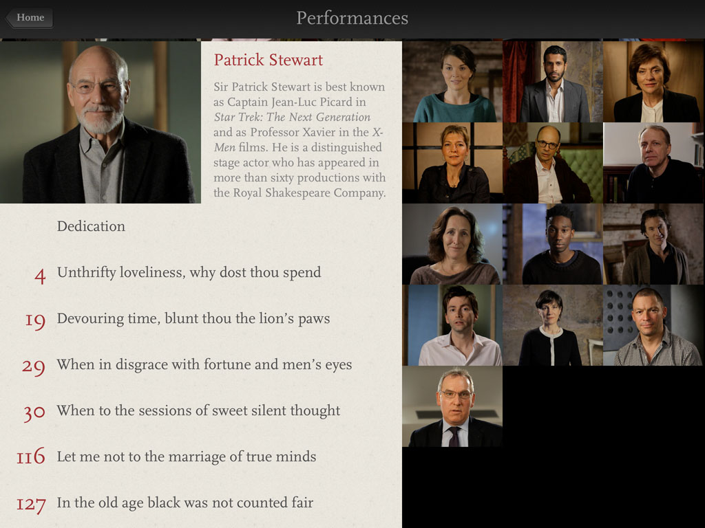
Fig. 13: A screenshot from Shakespeare’s Sonnets by Touch Press.
Shakespeare’s Sonnets, an ebook as app for the iPad made by London-based publisher Touch Press, is a much recognized example in the field of enhanced publications. The Sonnets embody several of the rich media characteristics described above. For instance, each sonnet is performed by a well-known actor. The performances are incorporated in the book as entertaining videos. The sonnets are accompanied by two different sets of annotations. It is also possible to browse the 1609 Quarto edition of the book. As well as merging text, video, and images, the book represents a social reading experience since users can share passages via email, Facebook, or Twitter.
In summary, rich media books are enhanced by multimedia, interactivity, and social features. The promise of rich media is an active, engaging, and public reading experience, thanks to intuitive – “natural” – forms of interaction, almost infinite paths to explore, and dynamic, high-res visual artifacts. While physical books appear in comparison as obsolete and inexorably doomed, the process to develop rich media often fits the print workflow that designers are used to, which is therefore reinforced.
The Poverty of Rich Media
What has changed since Voyager’s Expanded Books on floppies? Not much. Ok, books are not isolated anymore, they’re part of a shared experience, but the idea of sociality they foster seems to be confined mostly within the narrow boundaries of dominant social media platforms. Social reading can be more than tweeting passages. The same Bob Stein of the Voyager Company later founded the Institute for the Future of the Book, which focuses, among other things, on social reading technologies. One of these is CommentPress, a plugin for WordPress that allows multiple users to comment each paragraph, line, or word of a given text. Both the text and comments are not locked in the book, instead they can be extracted through copy-paste or RSS feeds. As seen above, Openbookmarks’ definition is a broad one. Here’s another example:
You’re reading a book on one device, but half-way through you switch to another ereader. Your position and bookmarks are automatically synchronised.
iBooks format does not fully allow this. Rich media often take advantage of the shared efforts to develop open standards for digital publishing without giving back. Even though the iBooks proprietary format is based on the EPUB standard, it can’t be read by other ebook readers. While iBooks format allows custom functionalities, it prevents users to leave the Apple’s ecosystem. This is how Ed Bott summarizes Apple’s strategy: “Enter a product category supporting a widely used standard, extend that standard with proprietary capabilities, and then use those differences to disadvantage competitors” (Bott 2012). Preservation is an issue as well: how do you deal with many competing standards? Looking back in history, not much from the era of multimedia CD-ROM has survived.
Both enhanced ebooks and books as apps undergo a quality check in order to appear on Apple’s or Google’s virtual shelves. What these companies mean by quality is not as straightforward as one may think. For instance, Seth Godin’s book was rejected by Apple because it included “multiple links to Amazon store” (Godin 2012). Geometric Porn, an app that shows “non-explicit description of sexual organs or activity” (“Geometric Porn” 2012) was rejected and suspended by both Apple and Google. These examples indicate that conflicts of interest and censorship not only concern interactive ebooks, but the impact on these is often greater. Users can still install an app or download an iBooks file from a source other than the Apple Store or Google Play, but it’s a clumsy, frustrating process.
Within the ideology of rich media, engagement through multimedia and interactivity is intrinsically valuable. Multi-touch gestures and transitions are portrayed as an unmediated, therefore deeper, mode of interaction with digital devices. The reality is different: according to Dragan Espenschied (2013), “Simple actions like searching, writing, editing, calculating, controlling became needlessly painful to execute […]”. The physical keyboard offers instead “the simplest two-level interface: Novice users can orient themselves visually, if they grow to use certain features more often or with more detail, they can use precise keyboard combinations and shortcuts to execute functions that are present in their minds rather than the computer screen.”
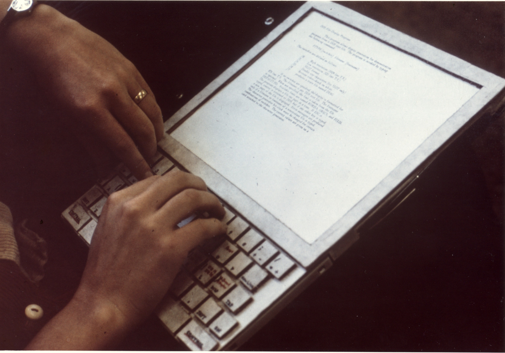
Fig. 14: Mockup of the Dynabook conceived by Xerox PARC’s Alan Kay, 1970s. Source: https://www.parc.com/newsroom/media-library.html
Many people compared the iPad to the Dynabook, a device prototyped by Alan Kay (‘magical paper‘, remember?) in 1972, which was not actually released because of the technological limitations of that time. Alan Kay (2013) himself did not approve such comparison, since the Dynabook was meant to be a device for intellectual production. The iPad, on the contrary, is consumption-oriented. No need to write code to realize this, structuring a short essay would be cumbersome enough.
‘Rich media’ is a marketing catchphrase. In the context of digital publishing, it is the idea of rich media itself that is sold. As in the Computer Chronicles, it is not multimedia content that counts, but its very presence, within a wider narrative in which slickness and high resolution correspond to technological progress. Likewise, interactivity is often there for its own sake, becoming free advertising for the device, reading software, and publishing ecosystem in general. “Widgets add Multi-Touch magic to books on iPad and Mac” (“iBooks Author” 2012). This is not the authentic magic Alan Kay was talking about; it’s a mere bunch of tricks as boisterous as the early Web banner ads.
Some hesitations are emerging. “We pursued distractions and called them enhancements.” This is how, in the New York Times, e-book designer Peter Mayers (2013) drily summarizes the recent history of multimedia digital publishing. Perhaps, instead of rich media I should speak of ‘baroque media’, media flaunting their opulence through ornamental user experience.
Softwares like iBooks Author and the Adobe DPS are easy to use: coding is not required and there’s no need to change the way a designer works. “Building a book is as easy as dragging and dropping” (“iBooks Author” 2012). Even though users can create their own widgets, iBooks Author is focused on customization. The DPS is an integration of inDesign. Both are the result of a very specific idea of what publishing is and how it is performed. An idea developed with print in mind and with the hurry to reach or build a digital audience. While this software work probably well for high-volume publishing enterprises, these tools produce reactionary workflows and publications. Supposedly, rich media are not expensive in terms of time, money, and labour. This is true as long as the paradigms encoded in the software are accepted. Florian Cramer (2014) puts it this way: “[…] we’re looking for pragmatic, working solutions – not snazzy design show-off work that may create wow-effects but will not be a workable model for real life […] Focus on showcase projects has been the achilles heel of all electronic and multimedia publishing efforts ever since the CD-ROM in the 1990s.”

Fig. 15: An iOS push notification.
One of the fields where rich media are supposed to have a groundbreaking effect is education. The assumption is that ‘digital natives’ are completely at ease with digital technology, therefore learning tools and methods must adapt to this new kind of cognition. Traditional textbooks are static, boring and therefore obsolete. The argument is generally supported by the frequent statistics showing the extinction of strong readers. The solution is books in which students “flick through photo galleries, rotate 3D objects, tap to pop up sidebars, or play video and audio” (“iBooks Textbooks for iPad” 2012).
Italian philosopher Roberto Casati (2013) names this phenomenon “digital colonialism.” Sharing Kay’s concerns, he highlights the way rich media discourage intellectual production. Furthermore, he argues that they impose a continuous and tiresome multitasking condition. Along with push notifications, a bestiary of other distractions inhabits the iPad’s environment. According to some of the early e-lit proponents, hyperlink was to revolutionize literature. Today, the reassuring consequentiality and peaceful inactivity of traditional books seems to offer an escape from this hammering information overload.
Rich media reflect the privileges of rich countries. Several enhanced publications are developed without considering hardware and network conditions on a global scale. In 2012, among the first eight textbooks available through iBooks, the smallest was more than 700Mb big. Some of them were bigger than 2Gb (Brownlee 2012). Such files require lot of available space and a very fast connection.
‘Rich Media‘ Is what Interactive Multimedia Stands for
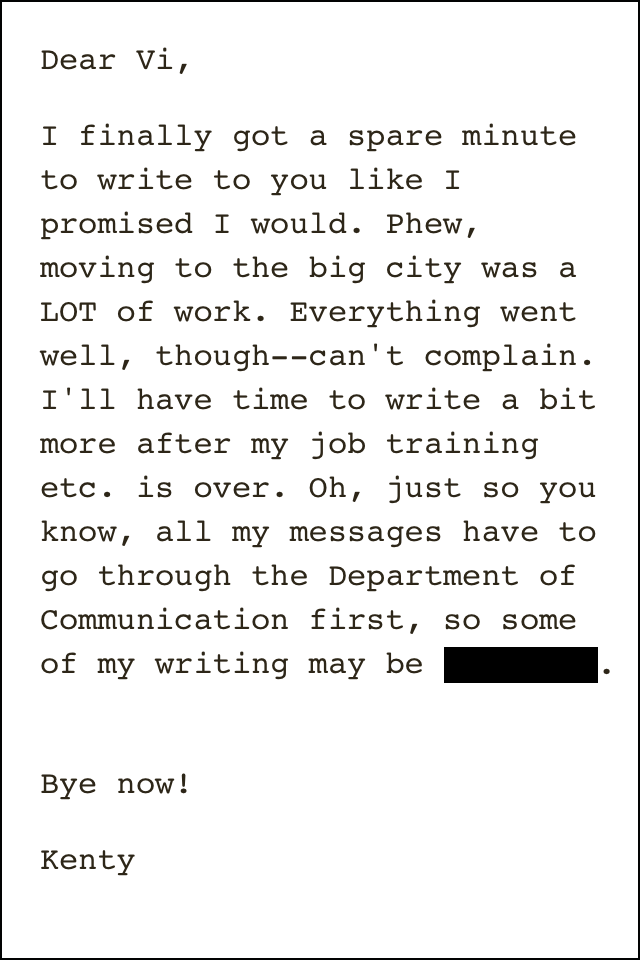
Fig. 16: A screenshot from Blackbar. Source: http://mrgan.com/blackbar/press/
A necessary clarification: I’m not against multimedia or interactivity. After all, this transcript includes videos and links. There are several interactive publications that I like. Blackbar is my favorite one: a text-based dystopia where the reader needs to guess censored words in order to proceed. Blackbar was made in 2013, but it could have been created 30 years ago. Is this a book or a game? Who knows… By ‘rich media’ I don’t simply mean interactive multimedia, but the blind business-minded enthusiasm towards these features. In many cases pushing interactive multimedia into ebooks only makes sense from the commercial point of view. The Web is a superb environment for multimedia and interactivity. Currently, browsers interpret HTML, CSS, and JavaScript way better than the render engines of ebook readers. But websites are not easy to sell. Lincoln Michel (2014) suggests a different territory: “Despite the regular hyping of enhanced e-books/hypertext/apps/interactive books, I don’t see those going anywhere outside of a few specific markets like children’s books and textbooks. The problem is that we already have a whole industry devoted to interactive narratives: video games.” But publishers see themselves as book makers and when they publish enhanced book, they indirectly promote the reading device: would people be interested in the iPad if there weren’t applications showing off its potential?
Part 2: Poor Media
While rich media mostly emphasize the characteristics of the book as a technology to be used and consumed, poor media express and corroborate its potential of duplication and dissemination. Since the way in which information is structured may encourage or, conversely, inhibit duplication, poor media also include technologies of production.
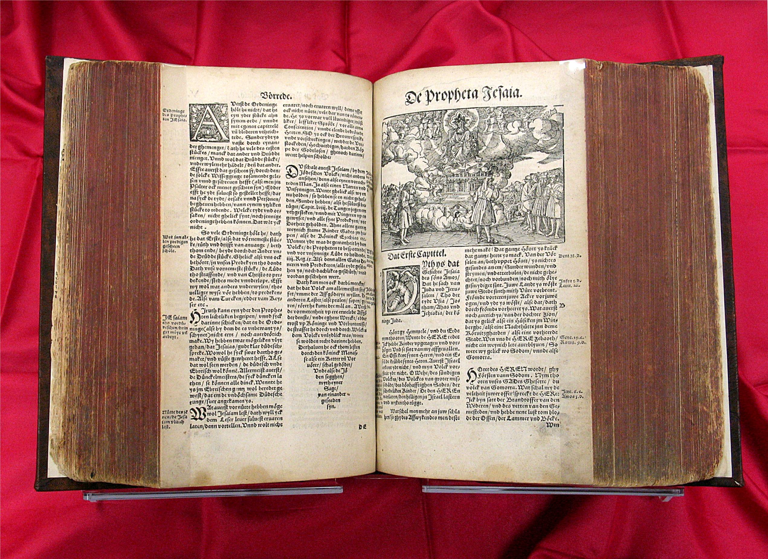
Fig. 17: Luther Bible, 1545. Source: http://library.dts.edu/Pages/TL/Special/sc_bibles.shtml
Like rich media, ‘poor media’ is a broad, multifaceted concept. Before outlining a definition, I’ll depict a few episodes in which digital publishing appears as a practice bolstered, stimulated, or activated by poor media. A consideration first: the whole history of the book, not just since the advent of digital networks, can be understood as the sacrifice of a certain idea of material quality in favor of a faster duplication or a broader reach. As Cory Doctorow (2004) puts it, “every successful new medium has traded off its artifact-ness – the degree to which it was populated by bespoke hunks of atoms, cleverly nailed together by master craftspeople – for ease of reproduction.” The Luther Bible was not as fancy as monks’ hand-illuminated bibles from the previous century, anti-soviet carbon-copied samizdat were fragile and vulnerable, mimeographed zines were mostly cheap and unruly.
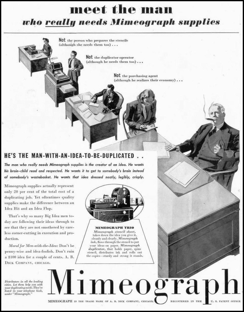
Fig. 18: Of course cheap duplicating technologies weren’t used only by activists and dissidents. Advertisement for the Mimeograph, 1939. Source: http://pixshark.com/mimeograph.htm
Project Gutenberg

Fig. 19: Xerox Sigma V mainframe computer. Source: https://ediebresler.wordpress.com/2011/09/09/long-live-the-e-book/
In 1971, during the night of the fourth of July, Michael S. Hart, at the time a Human-Machine Interfaces’ student at the University of Illinois, used the time available at the mainframe computer of his university (time that was worth millions of dollars) to retype and publicly distribute the text of the United States Declaration of Independence. At a time in which computers were mainly used for data processing, employing them for content distribution was not an obvious choice. In Hart’s (1992) words, “the greatest value created by computers would not be computing, but would be the storage, retrieval, and searching of what was stored in our libraries.”
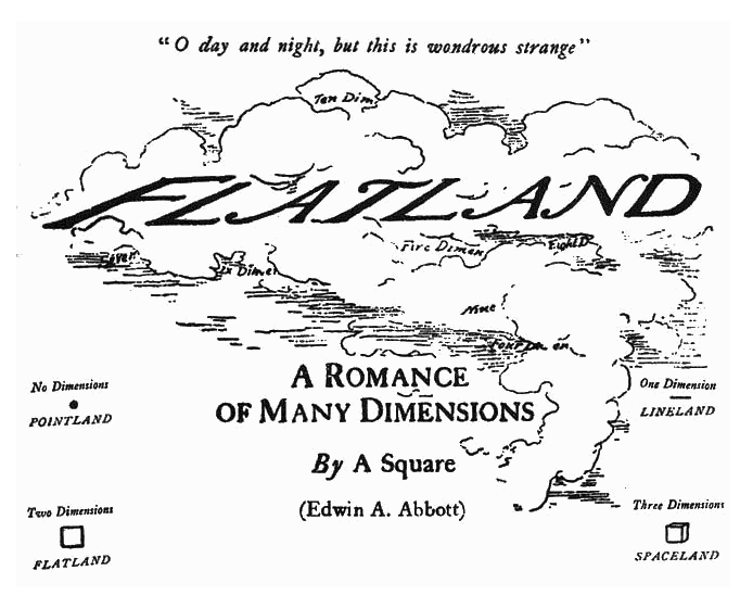
Fig. 20: Edwin Abbott Abbott, Flatland: a Romance of Many Dimensions, 1884. Frontispice.
Michael Hart was profoundly conscious of the duplicating potential of computers, which he considered a form of “replicator technology.” This attitude, together with the adoption of “Plain Vanilla ASCII,” a universally interchangeable standard for text, led to the development of Project Gutenberg, a volunteer-based platform whose mission is to “encourage the creation and distribution of eBooks” (Hart 2004). All the books on Project Gutenberg are released in the public domain and freely available for download.
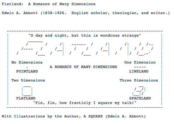
Fig. 21: Flatland’s frontispice, plain text version converted in 2008. Source: www.gutenberg.org/cache/epub/201/pg201.txt
Sometimes, the intrinsic limitations of plain text led to the development of interesting solutions in order to include illustrations and the paratextual elements of a publication. Consider this frontispiece of Flatland, made in 2008. Evidently, it is at the same time less and more than a neutral replica.
E-Zines
Let’s go back to Computer Chronicles for a moment. Jerod Pore, speaking of his Factsheet Five zine on The WELL, praises the instant availability offered by the Internet, highlighting how inexpensive it is to produce and distribute a work both in terms of time and money. At the same time, he doesn’t forget to remark that both electronic and print publishing don’t come for free if we consider natural resources.
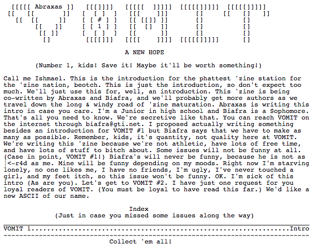
Fig: 22. Vomit e-zine. Source: http://textfiles.com/magazines/VOMIT/vomit001.txt
Like the early Project Gutenberg ebooks, e-zines were originally formatted as ASCII text. At first, they were spread through the BBS (bulletin board system). According to Jason Scott (1999), archivist at textfiles.com, “Instead of losing individual textfiles in the sea of BBSes, many writers chose instead to move to the ‘Magazine’ model, where they would band together textfiles and release them as a group. This strengthened the chances of the files surviving and also made for impressive file sizes, a sign of quality to people browsing sites.”
Bookwarez
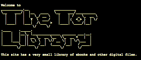
Fig. 23: Header of the Tor Library, a bookwarez collection accessible in the Deep Web. Source: http://am4wuhz3zifexz5u.onion/
Speaking of ebooks, Cory Doctorow (2004) indicates a phenomenon that goes under the name of ‘bookwarez‘. From Doctorow’s point of view, an ebook is not necessarily a digital publication produced and distributed by a proper publishing house, but rather a “‘pirate’ or unauthorized electronic edition of a book, usually made by cutting the binding off of a book and scanning it a page at a time, then running the resulting bitmaps through an optical character recognition app to convert them into ASCII text, to be cleaned up by hand. These books are pretty buggy, full of errors introduced by the OCR.”
Markdown
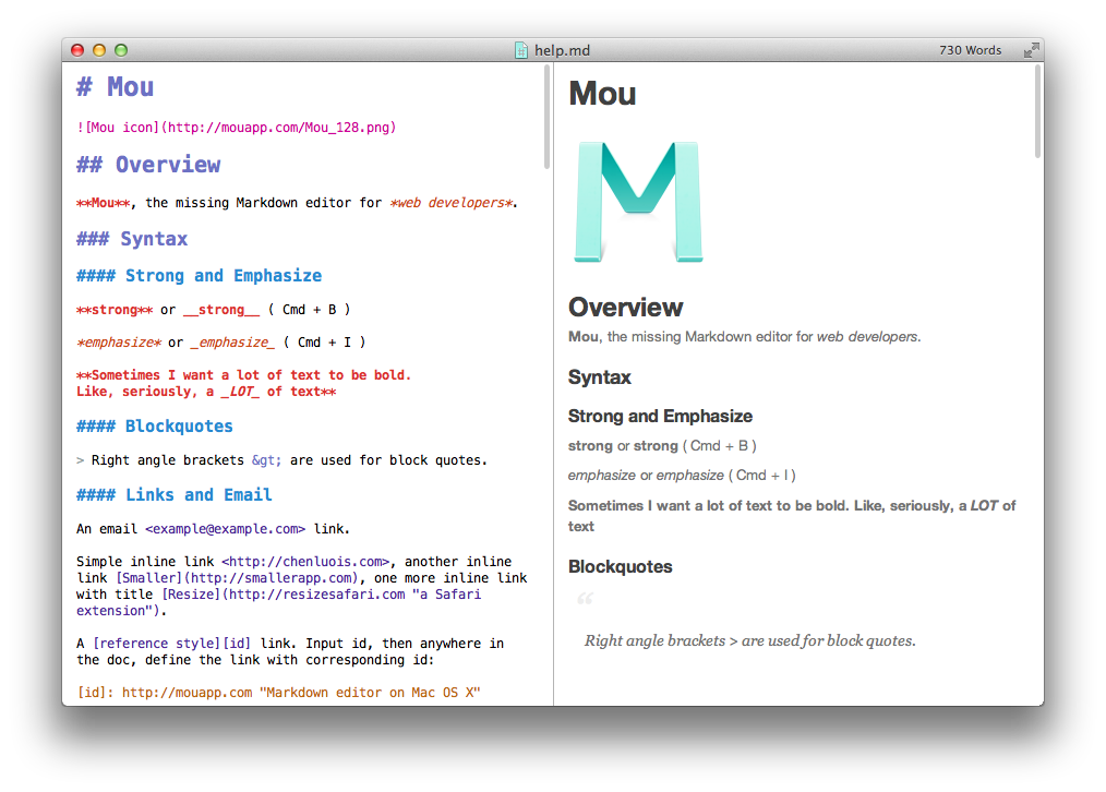
Fig. 24: Screenshot from Mou editor showing both Markdown source and the rendered HTML output. Source: http://25.io/mou/
Created by John Gruber in 2004, Markdown is a handy markup language that allows to create structured text easily convertible to HTML (but also EPUB, PDF, and more). Unlike HTML, Markdown is easily readable to the human eye: for instance, < em>italic< /em> becomes *italic*. Unlike the .doc format, Markdown doesn’t need a dedicated processor: one can write Markdown in TextEdit as well as in Gedit or in TextPad. “Markdown is a product of internet culture. It uses ad-hoc formatting signs commonly used in e-mail and chat platforms, and further popularized on blogging platforms […]” (Digital Publishing Toolkit Collective 2014). Although limited and somehow strict, Markdown encourages duplication and multiple instantiation of a text in different formats. It also facilitates archiving since its semantic structure is manifest.
EPUB
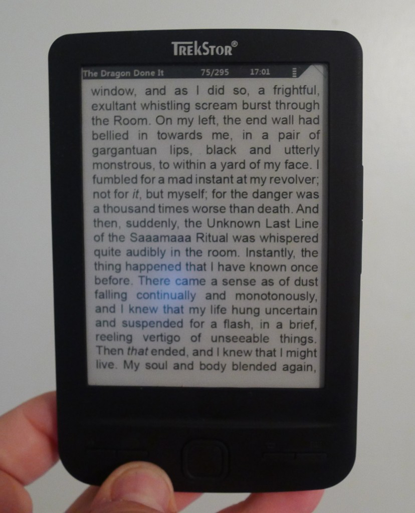
Fig. 25: TrekStor Pyrus Mini, the smallest E Ink reader available on the market. Source: http://the-digital-reader.com/2013/01/24/review-hands-on-with-the-worlds-smallest-ereader/
Originally developed around 1998 (OEB at that time), EPUB is a free and open standard for digital books developed by the International Digital Publishing Forum (IDPF). EPUB 3, its latest release, may include audio, video, and interactive elements programmed in Javascript. Despite this, I consider it a poor medium. Here is why: “A key concept of EPUB is that content presentation should adapt to the User rather than the User having to adapt to a particular presentation of content” (International Digital Publishing Forum 2011). Instead of imposing its features, an EPUB file tries to do its best in each possible situation, from narrow E Ink readers to multi-touch tablets. Furthermore, its inner architecture is crystal clear and easily accessible. An EPUB book is basically a portable website: a compressed series of HTML and CSS files together with metadata and structure.

Fig. 26: Transaction Record by Michael Nardone, 2014. Published by Gauss PDF as a PDF file. Source: http://www.gauss-pdf.com/post/75707986262/gpdf097-michael-nardone-transaction-record
The PDF format was created by Adobe more than 20 years ago on the basis of PostScript – a language that deeply contributed to the birth of Desktop Publishing – and later released as an open standard. Pretty much every word processor can export PDFs. This format is used for extremely diverse kinds of documents, from books to tax receipts. Although it is possible to include interactive elements and videos in a PDF, here I refer to its quintessential form: “an airline boarding pass, printed out or held open on a smartphone, or else it is the manual that explains the smartphone itself, or else the quarterly statements the smartphone corporation publishes for investors” (Gitelman 2014). While PDFs were originally meant for print, today’s browsers seamlessly render them. As Alessandro Ludovico (2014) points out, the PDF can be seen as a sort of sub-medium, since it evolved from a production standard to a standalone one.
Print on Demand

Fig. 27: Spread from Dear Lulu, an experimental book made in 2008 that reflects upon the limitations of POD systems. Source: http://p-dpa.net/work/dear-lulu/
Print on Demand (POD) is a system that allows even just a single copy of a book to be printed and made commercially available without any prior investment. Is this digital publishing? I’d like to think so. POD books represent a genuine hybrid of digital and analog processes: sent through the regular postal system, the physical book is the tip of the iceberg of an infrastructure that takes advantage of digital printing, desktop publishing, the PDF format, and Web 2.0. Moreover, as N. Katherine Hayles (2007) reminds us, “Digital technologies are now so thoroughly integrated with commercial printing processes that print is more properly considered a particular output form of electronic text than an entirely separate medium.”
From a graphic designer’s perspective, POD is very limiting: the choice is often among a couple of different papers and a standardized series of formats. When the amount of ordered book is small, black and white printing is the only convenient one. However, POD books are quickly produced and distributed: I upload the PDF, I get an ISBN, and my book is ready to be purchased (or downloaded). Immediately after, I can revise it as many times as I wish. The version triumphs over the edition. No intermediaries needed, apart from the POD platform I’ve chosen.
Poor media foster duplication and boost circulation. They are lightweight. Poor media suggest an active use: frequently they can be converted, dissected, remixed, reorganized, updated. The modest simplicity of poor media doesn’t contradict the possibility to preserve them. The duplicating aura they carry amplifies their resilience: “lots of copies keep stuff safe,” archivists say. The poverty of poor media should be better called frugality, since it’s characterized by the conscious, serene renunciation of embellishments in favor of accessibility and spread. The spartan look of poor media might not be beautiful, but it’s undoubtedly charming.
[A final remark: most of the ideas expressed in this talk emerged from the memorable two years-long collaboration with the Digital Publishing Toolkit Consortium and from fervent conversations with great people such as André Castro, Loraine Furter, and the members of OSP and Constant. I take this chance to thank them all.]
References
- “Adobe Digital Publishing Suite.” 2012. Adobe. http://www.adobe.com/products/digital-publishing-suite-enterprise.html.
- “An Overview of Rich Media.” 2001. Boldfish. http://web.archive.org/web/20011123200340/http://www.boldfish.com/BF_emguide/Notes/richmedia.html.
- Bolter, Jay David. 2001. Writing Space: Computers, Hypertext, and the Remediation of Print. Routledge.
- Bott, Ed. 2012. “How Apple Is Sabotaging an Open Standard for Digital Books.” ZDNet. January 22. http://www.zdnet.com/article/how-apple-is-sabotaging-an-open-standard-for-digital-books/.
- Brownlee, John. 2012. “Most iBooks Author E-Textbook Download Sizes Are Between One And Three Gigabytes.” Cult of Mac. January 19. http://www.cultofmac.com/141364/most-ibooks-author-e-textbook-download-sizes-are-between-one-and-three-gigabytes/.
- Casati, Roberto. 2013. Contro il colonialismo digitale: istruzioni per continuare a leggere. Roma; Bari: GLF editori Laterza.
- Coover, Robert. 1992. “The End of Books.” The New York Times, June 21. http://www.nytimes.com/books/98/09/27/specials/coover-end.html.
- Cramer, Florian. 2014. Florian Cramer on “The Art of Hybrid Publishing” Interview by Julia Rehfeldt. http://hybridpublishing.org/2014/09/florian-cramer-on-the-art-of-hybrid-publishing/.
- Digital Publishing Toolkit Collective. 2014. From Print to Ebooks: A Hybrid Publishing Toolkit for the Arts. Edited by Joe Monk, Miriam Rasch, Florian Cramer, and Amy Wu. Amsterdam: Institute of Network Cultures. http://networkcultures.org/blog/publication/from-print-to-ebooks-a-hybrid-publishing-toolkit-for-the-arts/.
- Doctorow, Cory. 2004. “Ebooks: Neither E, Nor Books.” In O’Reilly Emerging Technologies. San Diego, CA. http://craphound.com/ebooksneitherenorbooks.txt.
- “Electronic Publishing.” 1993. Computer Chronicles. https://archive.org/details/Electron2.
- Espenschied, Dragan. 2013. “The Right to a Real Keyboard (aka ‘Hardkeys’).” We, Computer Users, Demand the Right to …. October 11. http://userrights.contemporary-home-computing.org/6yf13/a-real-keyboard-aka-hardkeys.
- “Geometric Porn.” 2012. http://www.geometricporn.com/.
- Gitelman, Lisa. 2014. The PDF’s Place in a History of Paper Knowledge Interview by Trevor Owens. http://blogs.loc.gov/digitalpreservation/2014/06/the-pdfs-place-in-a-history-of-paper-knowledge-an-interview-with-lisa-gitelman/.
- Godin, Seth. 2012. “Who Decides What Gets Sold in the Bookstore?” The Domino Project. February 28. http://www.thedominoproject.com/2012/02/who-decides.html.
- Gruber, John. 2004. “Markdown.” Daring Fireball. December 17. http://daringfireball.net/projects/markdown/.
- Hart, Michael. 1992. “The History and Philosophy of Project Gutenberg.” Project Gutenberg. http://www.gutenberg.org/.
- ———. 2004. “Project Gutenberg Mission Statement.” Project Gutenberg. https://www.gutenberg.org/wiki/Gutenberg:Project_Gutenberg_Mission_Statement_by_Michael_Hart.
- Hayles, N. Katherine. 2002. Writing Machines. Mediawork Pamphlet. Cambridge, Mass: MIT Press.
- ———. 2007. “Electronic Literature: What Is It?,” January. http://eliterature.org/pad/elp.html.
- “iBooks Textbooks for iPad.” 2012. Apple.com. https://www.apple.com/nz/education/ipad/ibooks-textbooks/.
- “iBooks Author.” 2012. Apple.com. https://www.apple.com/au/ibooks-author/.
- International Digital Publishing Forum. 2011. “EPUB 3 Overview.” October 11. http://www.idpf.org/epub/30/spec/epub30-overview.html.
- Jobs, Steve. 2010. “Apple iPad Launch.” https://www.youtube.com/watch?v=vN4U5FqrOdQ&feature=youtube_gdata_player.
- Kay, Alan. 2001. “User Interface: A Personal View.” In Multimedia: From Wagner to Virtual Reality, edited by Randall Packer and Ken Jordan. New York: Norton.
- ———. 2013. An Interview with Computing Pioneer Alan Kay Interview by David Greelish. http://techland.time.com/2013/04/02/an-interview-with-computing-pioneer-alan-kay/.
- Kellogg, Carolyn. 2011. “Socially Networked Reading: Hey, Take a Look at This.” Los Angeles Times, December 22. http://www.latimes.com/books/la-et-book-social-reading–20111222-story.html#page=1.
- Ludovico, Alessandro. 2012. Post-Digital Print: The Mutation of Publishing since 1894. Eindhoven: Onomatopee.
- ———. 2014. “Post-Digital Publishing, Hybrid and Processual Objects in Print.” Aprja “Post-Digital Research” 3 (1). http://www.aprja.net/?p=1738.
- Mennella, Allison. 2011. “What Is ‘Social Reading’ and Why Should Libraries Care?.” TTW | Tame the Web. http://tametheweb.com/2011/06/14/what-is-%E2%80%9Csocial-reading%E2%80%9D-and-why-should-libraries-care-a-ttw-guest-post-by-allison-mennella/.
- Michel, Lincoln. 2014. “The Future Of The Future Of Books.” Buzzfeed. September 17. http://www.buzzfeed.com/lincolnmichel/the-future-is-never#3ie3rqm.
- “Multimedia.” 2015. Wikipedia. http://en.wikipedia.org/w/index.php?title=Multimedia&oldid=654190159.
- “Rise and Fall of Online Advertising.” 2015. 1stWebDesigner. Accessed March 31. http://www.1stwebdesigner.com/online-advertising-history/.
- Scott, Jason. 1999. “Electronic Magazines.” Textfiles. http://textfiles.com/magazines/.
- “Social Reading.” 2015. Google Trends. Accessed April 1. https://www.google.com/trends/explore.
- Steyerl, Hito. 2009. “In Defense of the Poor Image.” E-Flux, no. 10 (November). http://www.e-flux.com/journal/in-defense-of-the-poor-image/.
- Streitfeld, David. 2013. “Out of Print, Maybe, but Not Out of Mind.” The New York Times, December 1. http://www.nytimes.com/2013/12/02/technology/e-books-hold-tight-to-features-of-their-print-predecessors.html.
- The Huffington Post. 2012. “How Ebooks Are Changing Publishing,” October 5. http://www.huffingtonpost.com/2012/10/05/ebook-shapes-publishing-infographic_n_1943067.html.
- “What Is E-Lit?” 2013. Electronic Literature Organization. http://eliterature.org/what-is-e-lit/.
- “What Is Rich Media?” 2013. Google Support. https://support.google.com/richmedia/answer/2417545?hl=en.
- “What Is Social Reading?” 2011. Open Bookmarks. http://www.openbookmarks.org/social-reading/.