Title |
To View This Image — Story of a Hybrid Textbook |
Author |
|
Date |
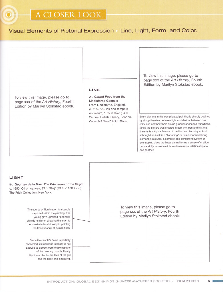
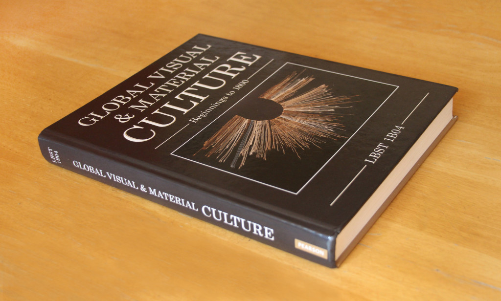
My first college textbook was missing its images. Global Visual & Material Culture was a marvel of post-digital publication gone awry.
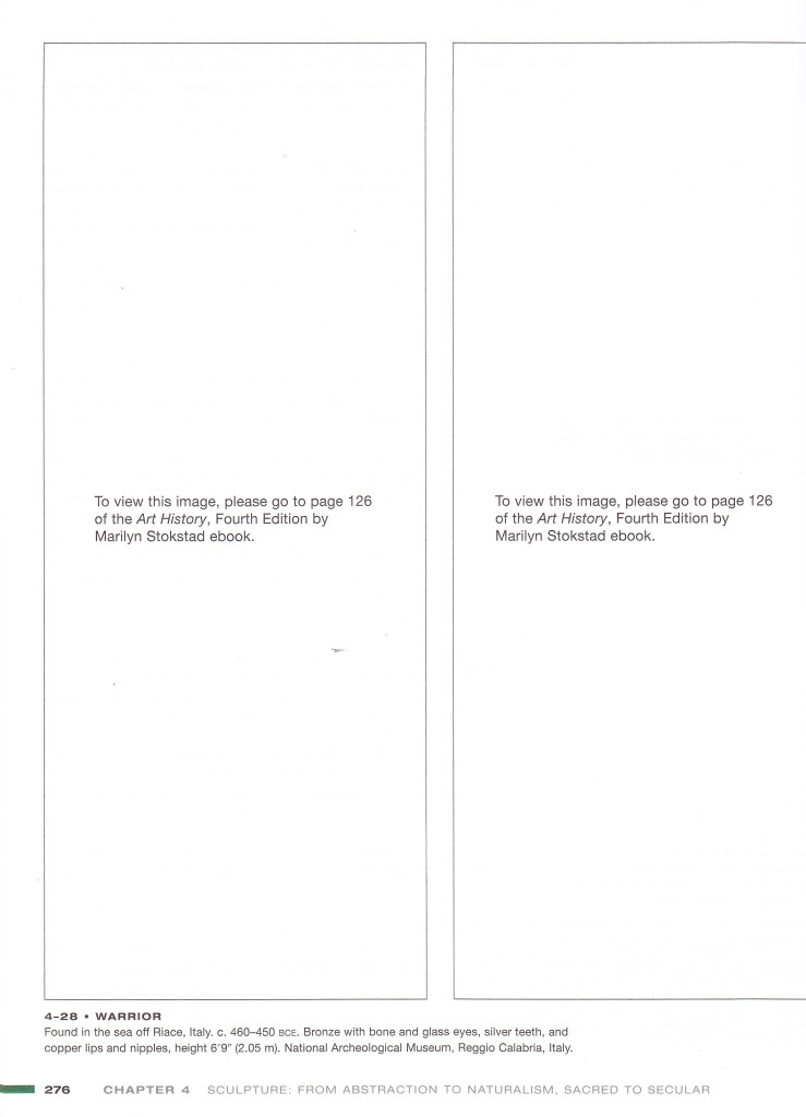
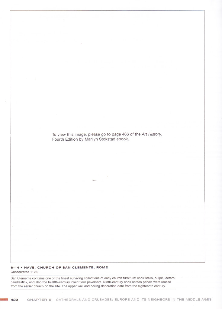
The textbook was a custom publication made specifically for our course, edited by faculty in collaboration with Pearson Canada. It was essential for the class, and it cost $180. On opening it up, it immediately became clear that the project had not gone according to plan. Though the book’s approach to image linking suggested a certain degree of intention (the unapologetic tone of the ‘to view this image’ in each box), it was baffling to imagine that such an approach could have been deliberate. Criticism became vocal as the course began, and the school acknowledged that the hybrid format had been chosen only in order to keep costs down when it surfaced that licensing so many images for print would make the custom reader unbelievably expensive to produce.
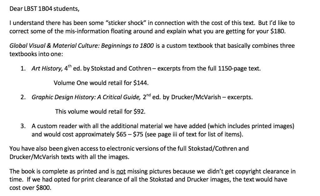
It seemed that our school had been seduced by a post-digital product offering that would prove misfortunately unconsidered. An artist and writer named Katherine Tyrrell was the first to draw the connection between our textbook and Pearson’s ‘Custom Solutions’ marketing material, which offers to help you, the educator, ‘put yourself in the driver’s seat’ to create ‘a streamlined experience for your students.’ Tyrrell noted that this offering was uniquely ill-advised for visual culture subject matter ‘because of the particular expenses associated with images and copyright.’ For an image-heavy publication intended for the small audience of one class, she suggested, it should have been obvious that licensing would make customization’s notional merit into a losing proposition.
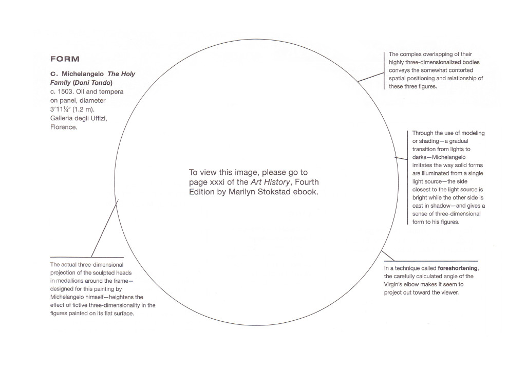
Speculating with Tyrrell that this understanding wasn’t there at the outset, however, the effort to salvage the project by turning it into a hybrid publication—providing the images via references to e-books Pearson could make available essentially for free—must at the very least be recognized as a creative attempt at a workaround. Someone realized that hybrid publishing could offer the chance for a clever evasion, allowing the textbook to go forward in an arrangement that would sidestep licensing rules articulated for print.
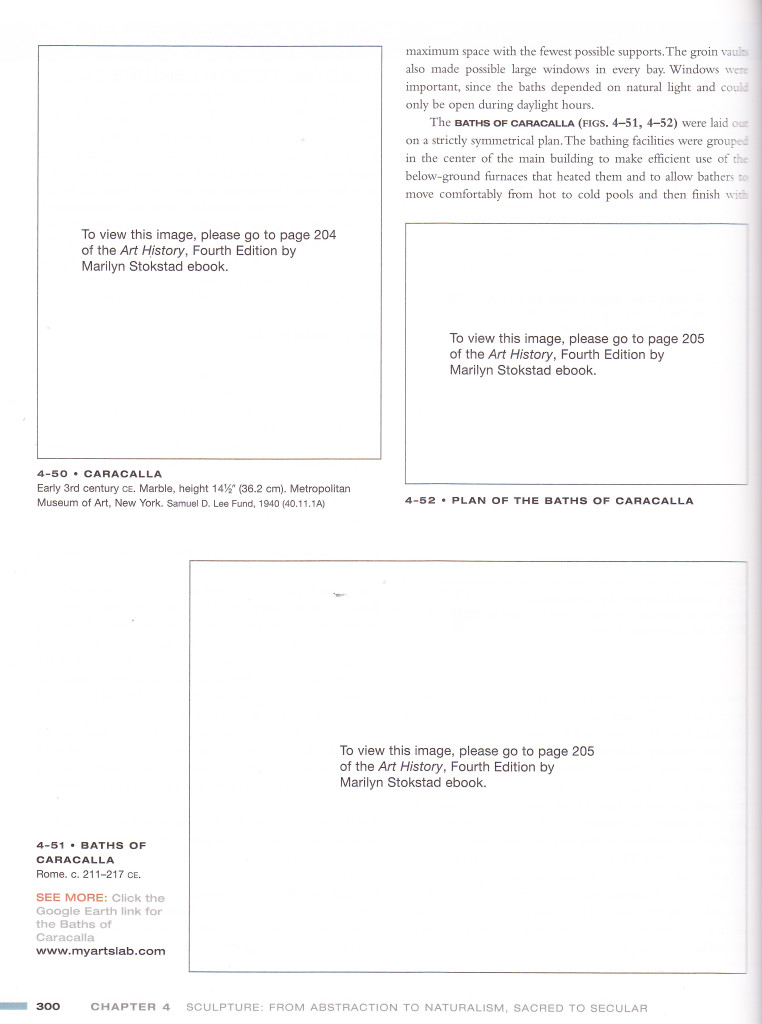
If this had been carried out with more nuance, it might have worked. But design was missing from the rescue: the layout made clear that images were meant to be included. As well, the hardcover format of the printed volume felt decadent under the circumstances, and the lasting value it suggested was betrayed entirely when we learned that access to the e-books and their pictures would expire at the end of the course. The outer surface of the publication, including its title, bluffed a sense of wholeness that quickly gave way to the uncomfortable feeling of demo software the moment one flipped to a page. Now that the course is over and our e-book access is gone, the book has decomposed into permanent incompleteness. As Cory Doctorow observed at the time, ‘it will not serve as any kind of lasting visual reference.’

Caption in the National Post.
We were outraged, but also amused. Looking back over the controversy that unfolded, I read the textbook as a successful (if unintended) outcome of what design researcher Carl DiSalvo has called ‘adversarial design,’ or the practice of evoking and engaging political issues ‘through designerly means and forms’ (2). The white space motif linking to an image in an e-book registered almost as a taunt, arrogantly withholding access to the works under discussion. Paired with its price, this sneer by the interface made the publication a potent, laughable symbol to rally against, one that seemed to crystallize all the excess and coercion of an increasingly corporatized higher education.
More than 600 students signed a demand for either a full refund or a working alternative produced fully in print or fully online at a lower price. Two open forums were held at which concerns could be raised and questions posed. The episode was reported by several local news media, including the Toronto Star, the National Post, and CP24. BoingBoing, Gawker, and Techdirt covered the story as well. Commentators online were quick to note that the course dealt specifically with works produced from ancient history to 1800, and drew suspicious attention to the institutional arrangements between museums, publishers, and universities that combine to wrest heavy fees from students for contemporary images of artefacts made long before copyright existed. In the end, Pearson apologized and gave each of us a set of the five-volume Art History from which much of the textbook was drawn, and also offered to buy back each student’s copy for $50.

I chose to keep mine, and I treasure it. I love the obviousness of its commitment to a visual culture synonymous with private property, and I love what it reveals about the way design buries politics when it doesn’t go wrong. One of the best insights on this subject came from Brent Ashley, a parent who was the first to write about the book online:
Had this been designed as an online reference with a spiral-bound offline study guide with references, I would have still argued the price but it would not have provoked quite the same visceral reaction.
Ashley observes that a more coherent treatment of the analog-to-digital references would have closed down much of the irony and outrageousness that made the book such a scandal, even if its price, awkwardness, and impermanence had remained. The publisher could probably have asked the same price without provoking opposition if it had designed away those aspects of the publication that were easiest to criticize and laugh about. Re-designing the book for a text-only layout with understated references to online images would certainly have taken some time, but it would have been highly strategic to do so under the circumstances. By imagining a Global Visual & Material Culture that would better sedate one’s visceral reaction (while still taking $180), Ashley’s comment invites us to consider one aspect of graphic design’s functioning as almost authoritarian, fortifying objects, organizations and systems with an aura of normalcy that mystifies the possibility of intervention. As it was, without the aura, our textbook couldn’t weather the delegitimizing influence of concerted student protest and bad press.

The book bears a striking resemblance to Jason Huff’s The Story of Art, an edition of E. H. Gombrich’s history of the same name in which all of the images have been replaced by broken image-link icons. The textbook carries Huff’s work forward accidentally, stubbornly demanding that it not be read as art. Its bluster makes Huff’s thinking all the more prescient, investing his reflection on media, obsolescence, expectation and art history with the commercial intent of a traditional publisher trying to stay ahead of change.
On this level, the book also offers an unlikely entry into Alessandro Ludovico’s discussion of post-digital print as a limited-edition object: the sense that ‘print can still be used to create something no other medium can—a precious object, something to preserve, to instinctively trust’ (108). The ‘Custom Solutions’ offering responsible for Global Visual & Material Culture trades on precisely this, making a back catalogue newly valuable by packaging it in curated fragments with traditional textbook styling.
At the very least, our textbook offers a clear example of what Silvio Lorusso has described as e-is-for-ersatz-publishing. The hybrid solution was a ‘deficient surrogate’ for the real thing, shirking many of a textbook’s traditional responsibilities (to last, to be possible to lend and resell, to respect the privacy of its reader… ) while still demanding all of its value.
The result is nonetheless an object more precious for its failings, something to preserve with all the more affection. It may ‘not serve as any kind of lasting visual reference,’ to return to Cory Doctorow’s remark, but it will always evoke something of its anxious moment in early twenty-first century educational publishing.
- Tim Alamenciak. ‘Art history textbook missing art.’ Toronto Star. September 18, 2012.
- Brent Ashley. ‘Copyright and the pictureless Art History textbook.’ September 16, 2012.
- — ‘It’s as bad as that and worse.’ September 17, 2012.
- — ‘Remember, that $180 is for a single term. It’s another $180 for next term’s pretend textbook.’ September 18, 2012.
- — ‘It’s a Design flaw.’ September 19, 2012.
- — ‘To Summarize…’ September 23, 2012.
- The Canadian Press. ‘$180 textbook with blank pages raises eyebrows.’ CP24. September 23, 2012.
- Carl DiSalvo. Adversarial Design. Cambridge: MIT Press. 2012.
- Cory Doctorow. ‘A mandatory $180 art school textbook about “prehistory to 1800” with no pictures, thanks to a lack of mysterious “copyright clearances.”’ BoingBoing. September 18, 2012.
- Alyshah Hasham. ‘Publisher offers free textbooks, buyback option for artless-art history text-book.’ Toronto Star. September 25, 2012.
- Jason Huff. The Story of Art. 2010.
- Silvio Lorusso. ‘FAQs.’ Post–Digital Publishing Archive. April 27, 2016.
- — Correspondence. December 27, 2015.
- Alessandro Ludovico. Post-digital Print: The Mutation of Publishing since 1894. Eindhoven: Onomatopee, 2012.
- Kathy Shailer. ‘Letter from Dean K. Shailer re custom textbook.’ September 13, 2012.
- Mike Masnick. ‘University Requires Students To Pay $180 For “Art History” Text That Has No Photos Due To Copyright Problems.’ Techdirt. September 17, 2012.
- Graeme McNaughton. ‘$180 art history text that contains no art sparks petition on Toronto campus.’ National Post, September 18, 2012.
- — ‘$180 art history text book with no art has blank spaces where the pictures should be.’ National Post, September 18, 2012.
- Pearson Higher Education. ‘Custom solutions facilitate student success.’
- Katherine Tyrrell. ‘Art History – a set text book with no pictures!’ Making A Mark. September 22, 2012.
- — ‘OCAD / Pearson Art Textbook Update.’ Making A Mark. September 27, 2012.
- Neetzan Zimmerman. ‘Art School’s Expensive Art History Textbook Contains No Actual Art.’ Gawker. September 18, 2012.